

brand identity + website
deschutes eyecare
A full brand identity and website for a modern, neighborhood optometry practice in Bend, Oregon.
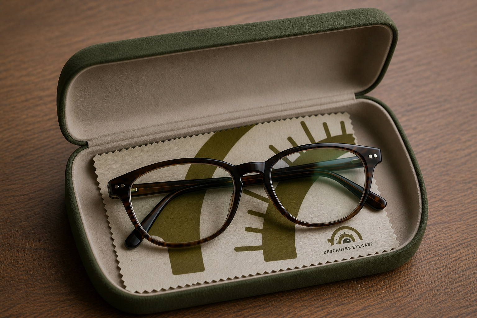
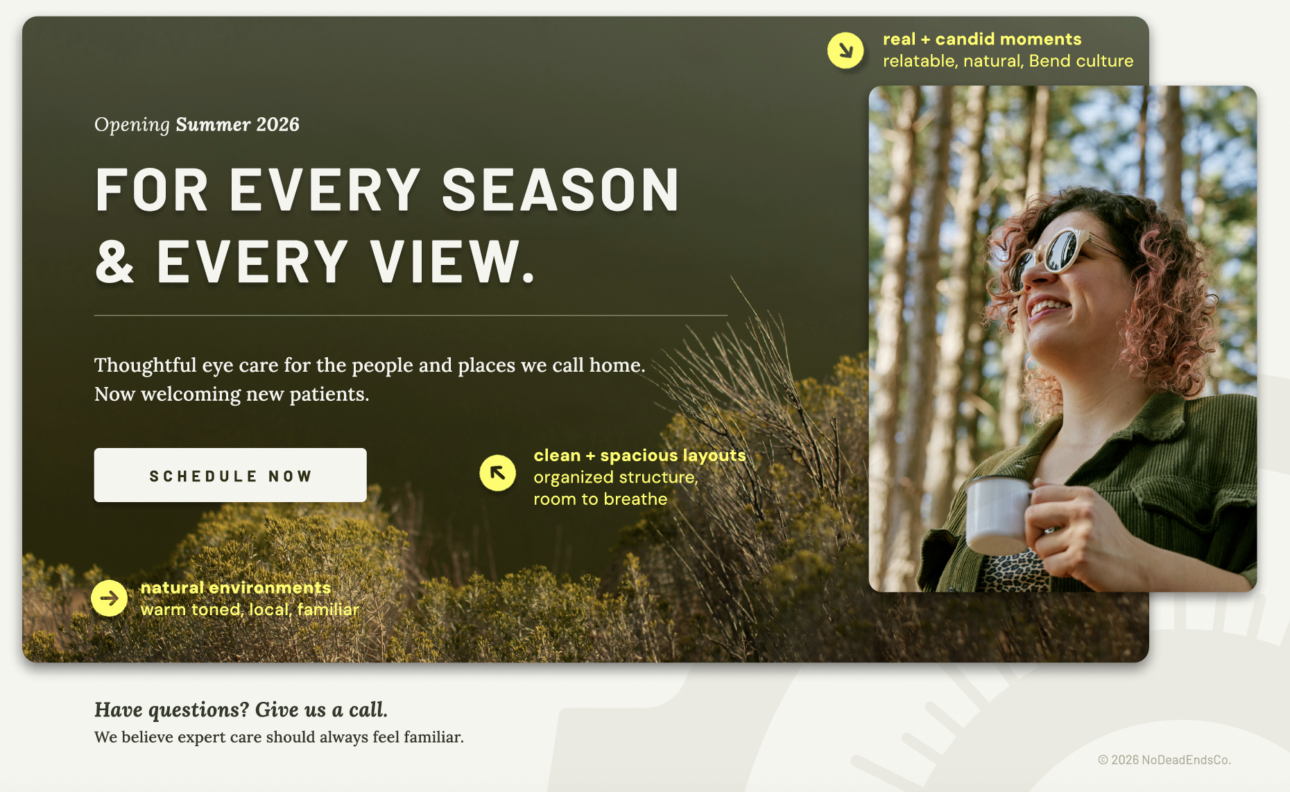
Designed to feel simple, established, and modern - the design system balances clinical trust with a warm, family-oriented tone, reflecting both the pace of Central Oregon life and the growing Reed Market corridor.
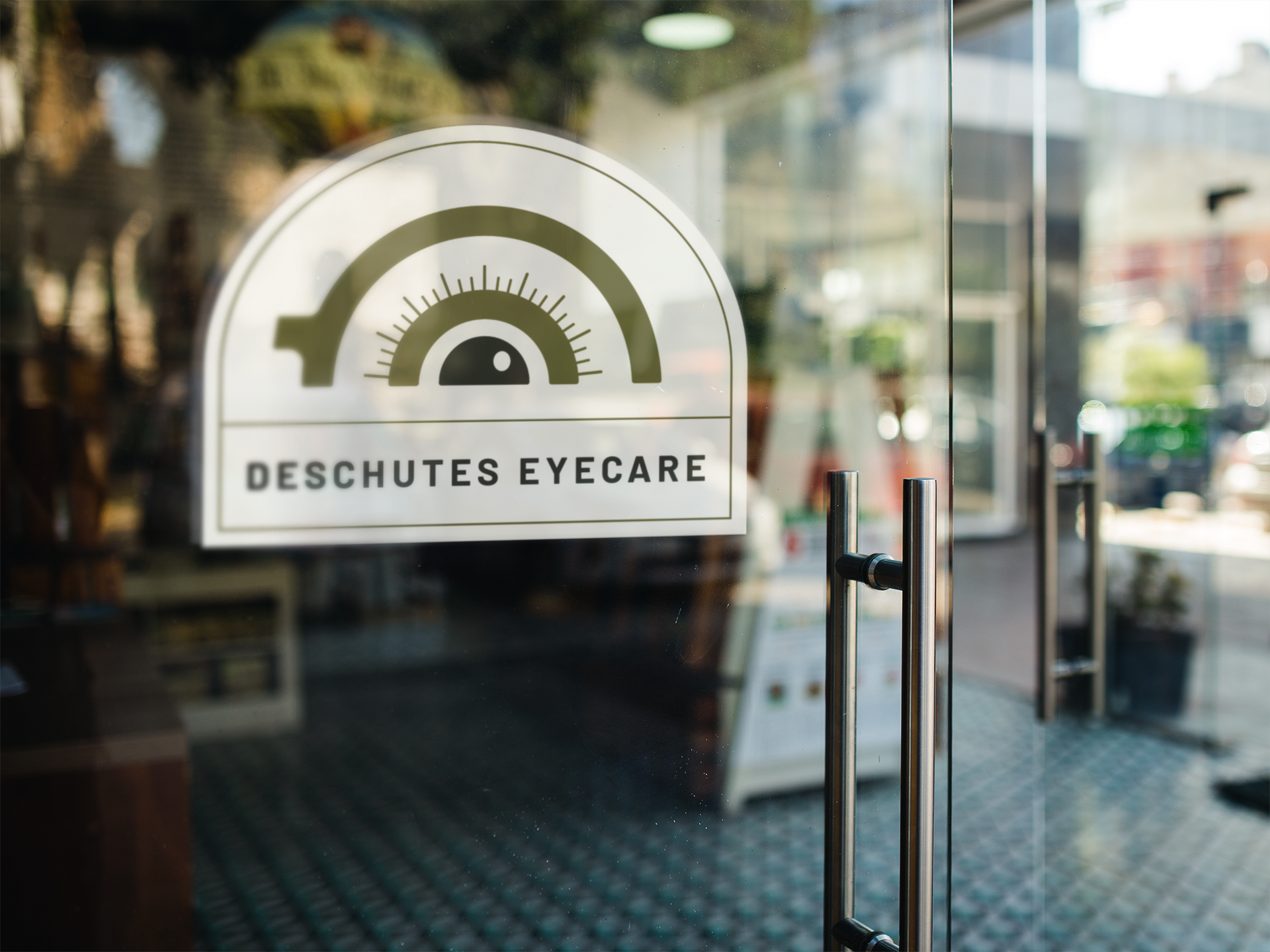
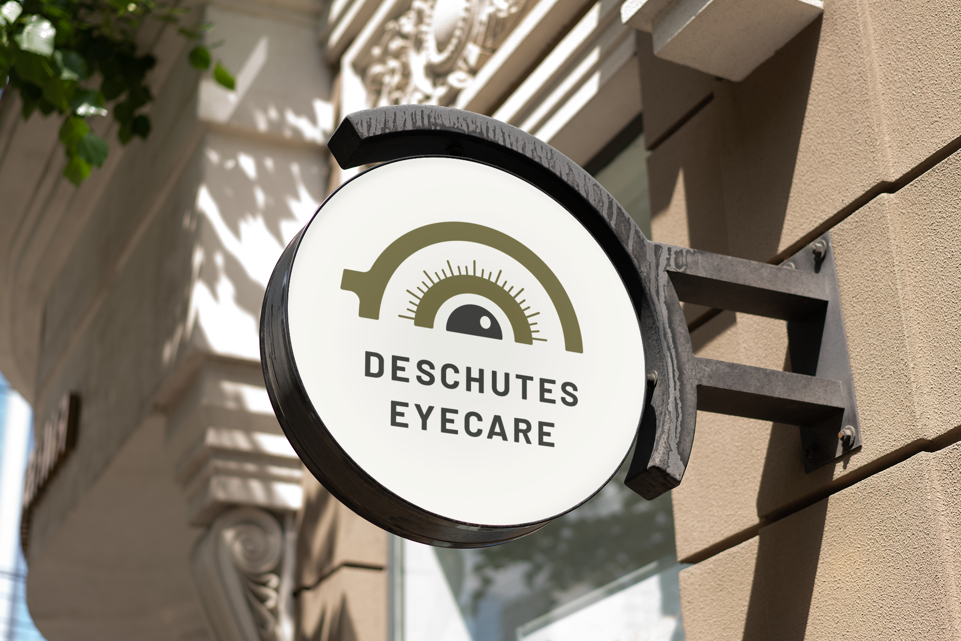
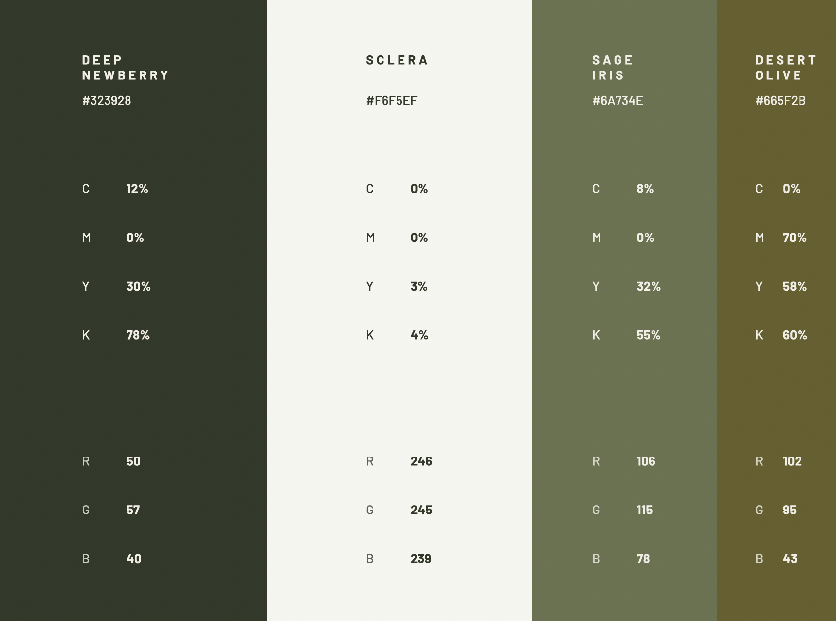
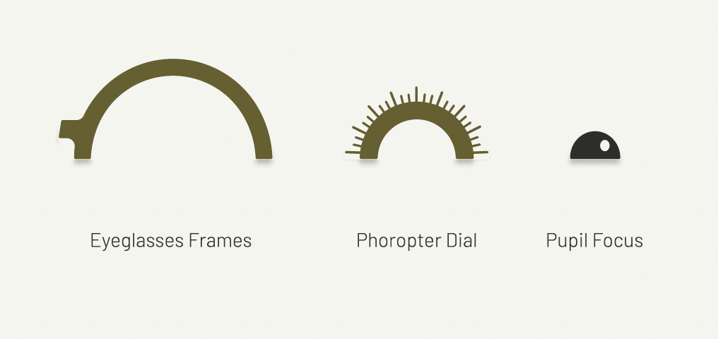
The logo mark draws from optical instruments and human focus, moments when vision and life become clear. The color palette references the familiar desert landscapes across Bend.
Across signage, print, and digital, the identity is built to feel familiar on day one; while setting the standard for trusted and contemporary clinical care in Bend.
Simple but not sterile.
Straightforward but not obvious.

I don't want it so clean and simple that it feels hospital-sterile.
…i want people to know its eye care - but not be just a giant eyeball.
- dr. ulrich o.d.
+ Logo Suite
+ Color Palette
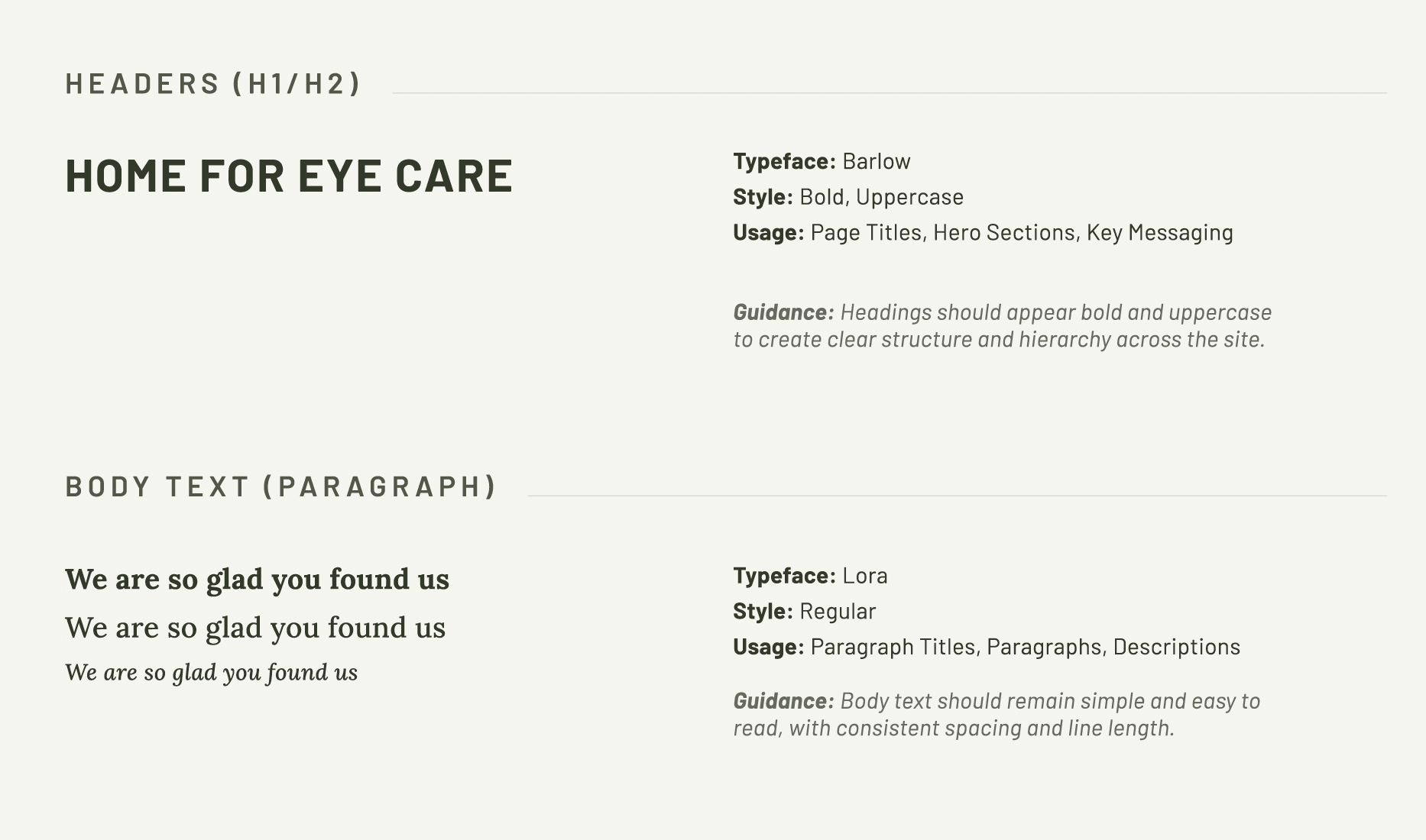
+ Typography
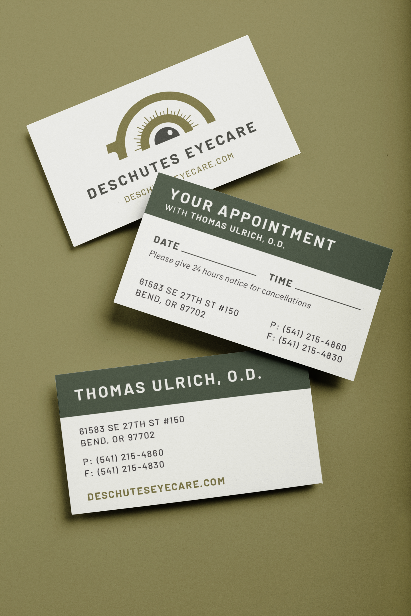
+ Business Cards
+ Appointment Cards
+ Brand Identity & Visual Direction
+ Mobile-Responsive Website
+ User-Centered Design
+ Copywriting
+ Ready-for-Launch Handoff