


Stay on track, no matter the setback.
Project Overview
Over 4 months, I was the lead ux/ui designer for a new adaptive workout feature for MyFitnessPal, addressing a critical user gap:
no existing modification support for users managing injuries or mobility limitations
(Above) Final prototype of FlexMode
A 2019 medium case study found
53% of users
want rehab-related content in fitness apps.
a 2021 study published by pubmed central cited that, “a global rise in the incidence of noncommunicable chronic diseases will cause an associated rise in the prevalence of disability and will be responsible for 75% of all deaths by 2030, thereby creating the most significant public health problem of the 21st century.”
yet large platforms like MyFitnessPal offer no guidance for users with temporary or permanent limitations, leaving them to research independently.
01
overview
The Main problem:
mobility limitations require
users to research and plan their own modifications,
ultimately leading to users feeling fatigued and frustrated.
project goals:
Define what makes an alternative exercise "safe" and "successful"
Understand how users modify and find exercises
Understand the effects of skipping or abandoning an exercise
Determine where user fatigue starts while searching for modifications
Research Questions:
What do users experience when searching for an alternative exercise?
What factors lead to an exercise needing modification?
What effect does seeing an alternate option have on users?
What makes some workouts feel successful compared to others?
02
research
& discovery
Methods:
User Interviews
Affinity Map
SWOT Analysis
Research participants:
users with temporary or permanent
mobility limitationsused myfitnesspal
tracked workouts on a mobile app
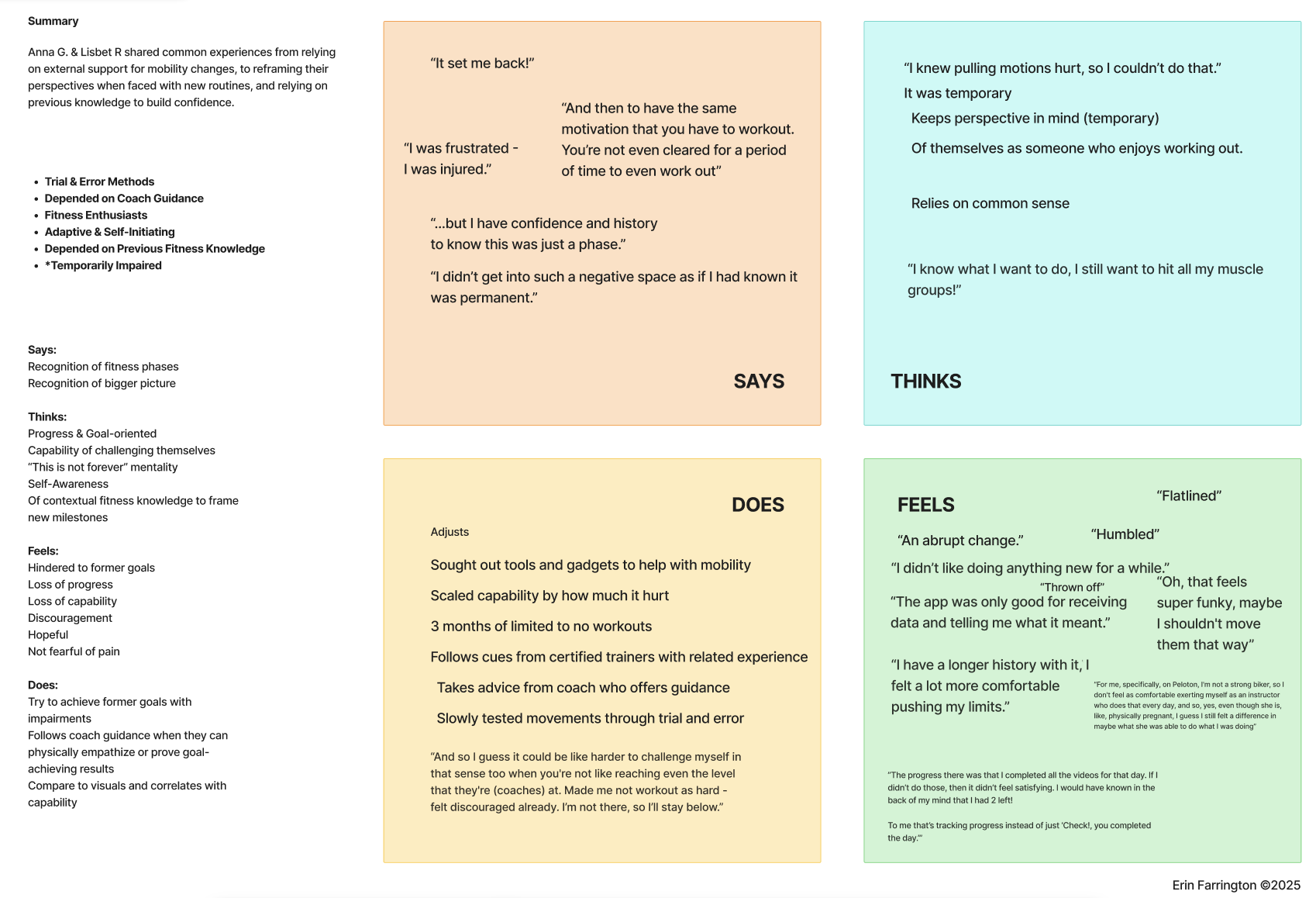
Key user values:
Data Interpretation is the Greatest Asset
Responsive Feedback Sustains Motivation
Recovery Indicators Signal Readiness
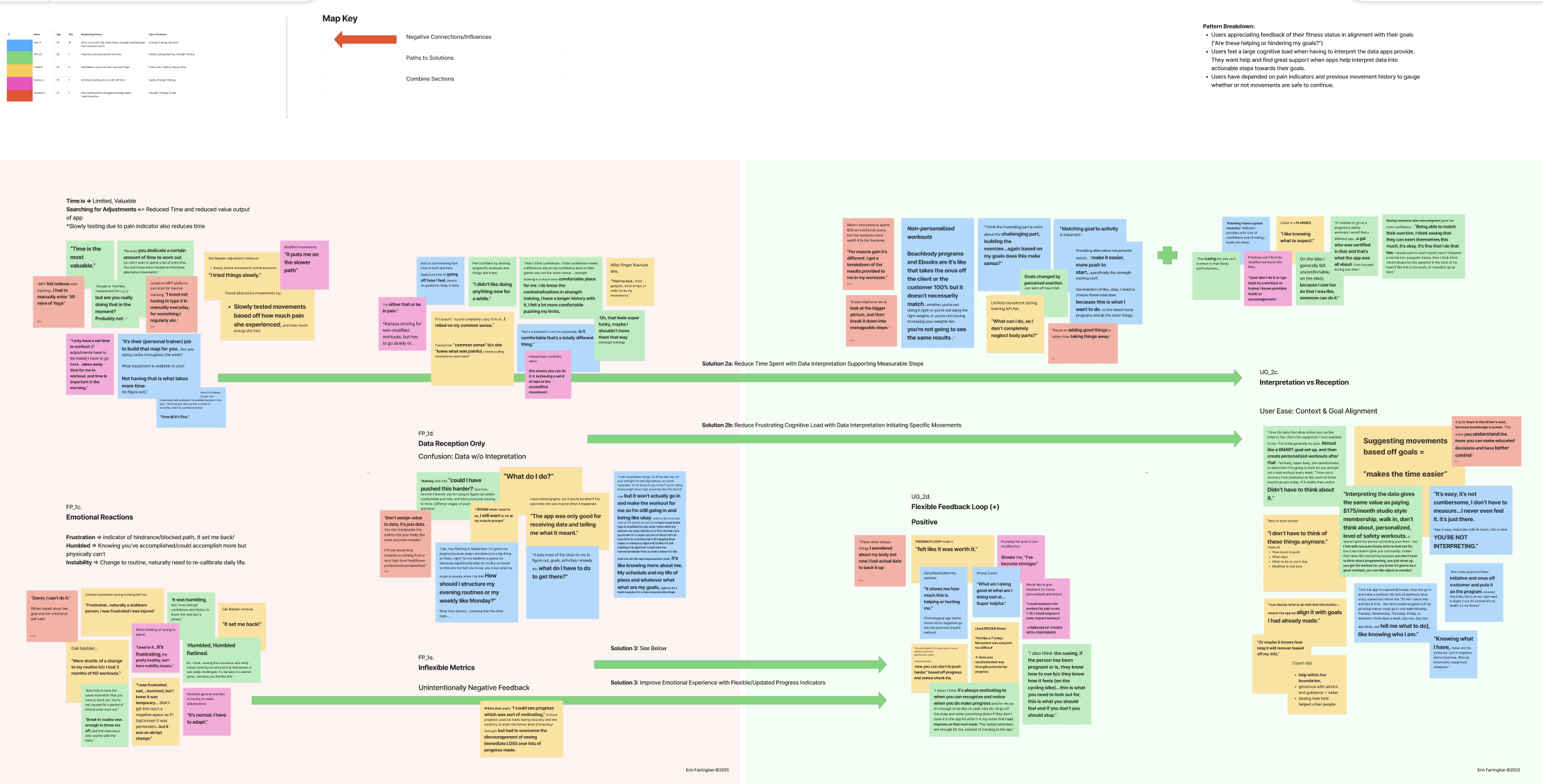
(Above) affinity map, patterns, and potential intercepting points for solutions
KEY FINDING
Users don’t want more data.
they need adaptable progress metrics
and interpreted data that aligns to their recovery goals and helps them feel acknowledged.

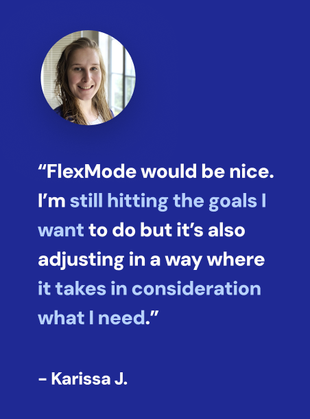
“they (fitness apps)
just assume you’re healthy and have no problems.”
- karissa j.
refocus primary needs and solution
research shifted the original solution from:
How might we equip mobility-impaired users with modified exercises when they encounter movements they cannot perform?
to a user-informed solution:
How might we provide mobility-impaired users on MyFitnessPal with movements attentive to their current ability, responsive feedback, and actionable data that supports their progress and recovery goals?
03
user personas
& prioritization
personas
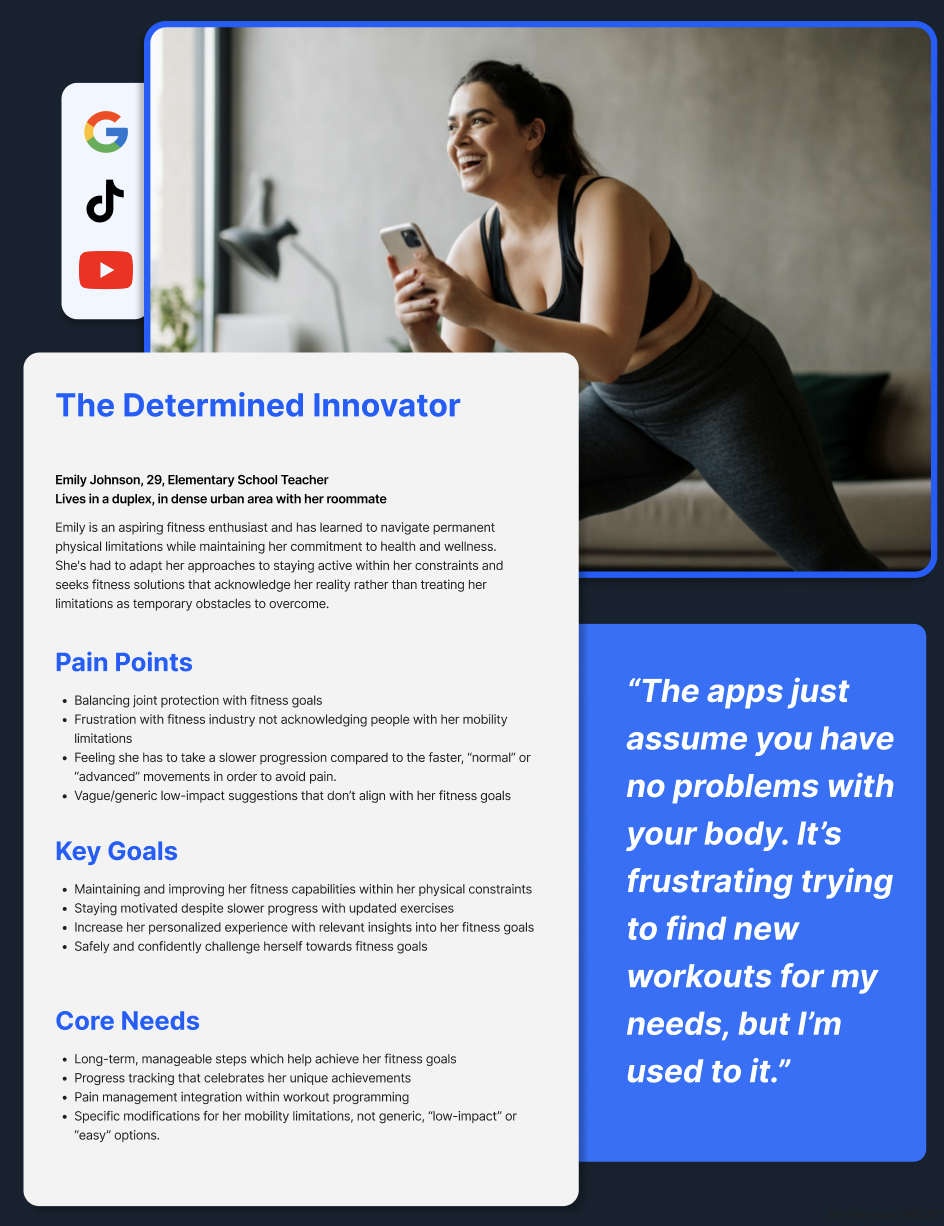
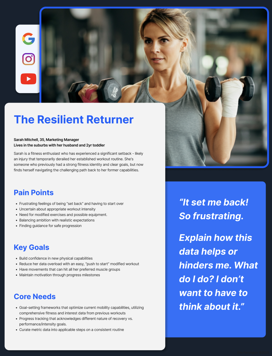
Two key personas emerged from the user data, differentiated between temporary and permanent limitations.
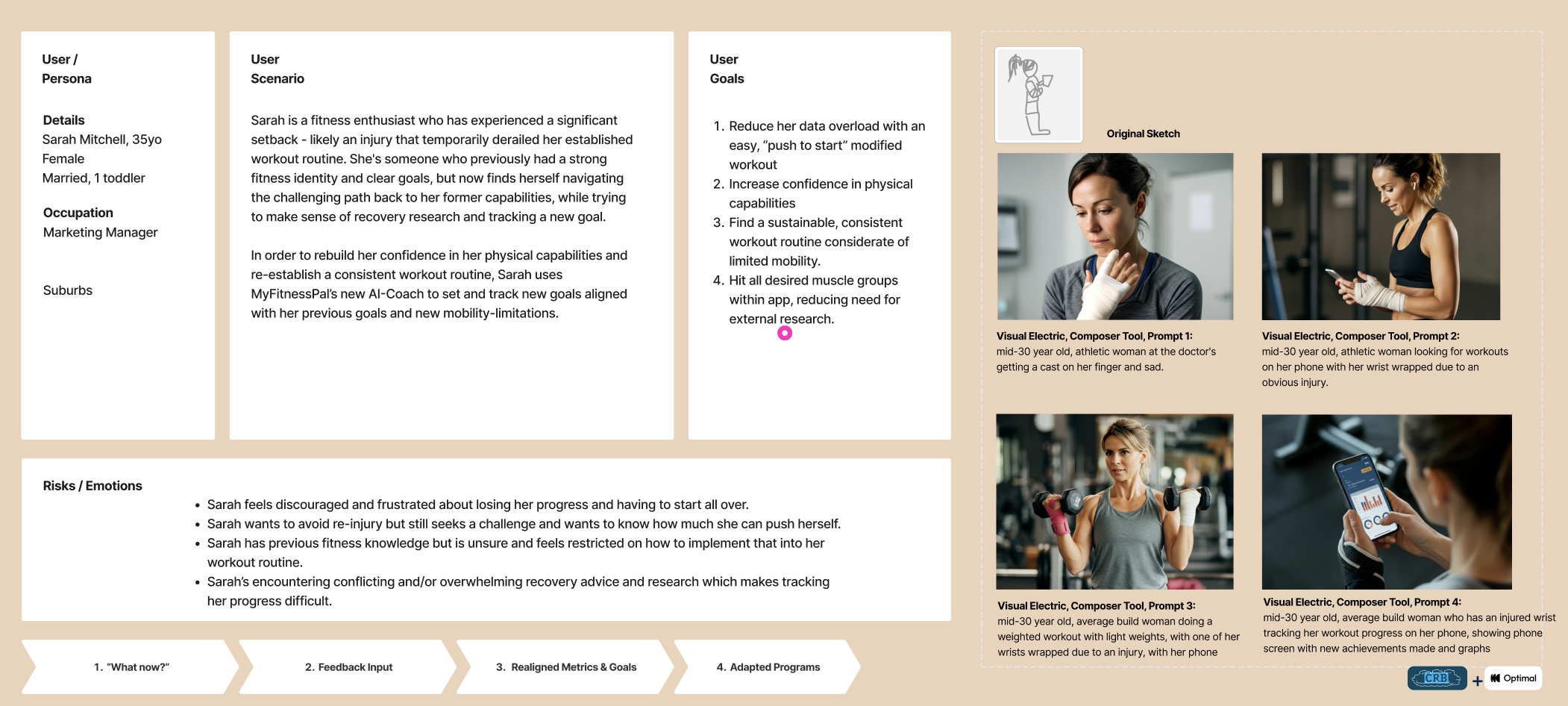
The resilient returner (short-term)
The Determined INnovator (long-term)
both resonated with the feelings of being dismissed by fitness apps while adjusting for or managing pain.
Methods:
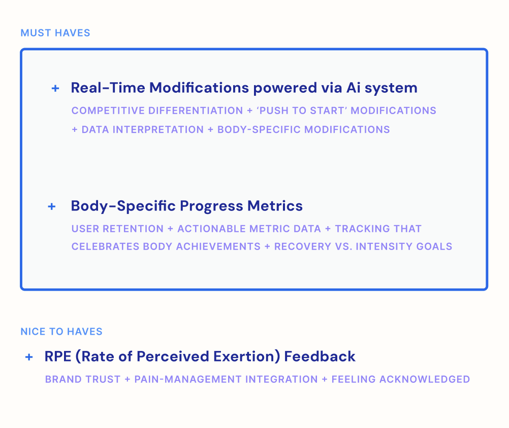
MosCow prioritization
empathy maps
user scenarios
project v. business venn diagram
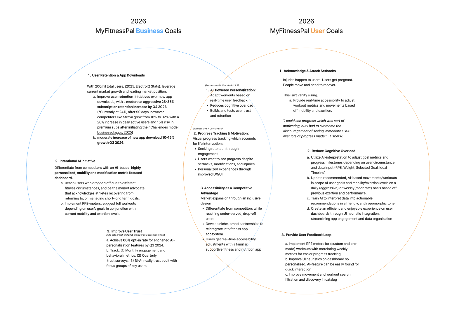
Goal overlap
Business goals
MyFitnessPal was a market leader in nutrition & strength-training tracking, however it has recently faced challenges related to:
maintaining user retention
establishing competitive differentiation
cultivating brand trust
Business needs
user onboarding
competitive edge (whoop, apple fitness, nike, etc.)
better brand approach, enhance the “my” in myfitnesspal
User goals
Users are adaptive, subject to change, and deserve tools that provide flexibility and motivation when these circumstances occur.
reduce cognitive overload
maintain motivation
feel confident to perform safe exercises
User needs
acknowledgement of their ‘start’
interpreted data
action indicators
pain-management feedback
body & intensity specific modifications
“interpreting the data gives the same value as paying a $175/month studio style membership.”
— Anna G.
features
04
structuring solutions
summary
Although the user flow was met with positive reviews for the resilient returner persona - lo-fi frames revealed an awkward and disruptive experience.
too much focus was placed on adjusting for impact and goal setting. emphasis doesn’t mean it needs to necessarily come first in the flow.
when transitioning into hi-fi, it became very clear the lo-fi frames needed to be simplified to match myfitnesspal’s flatter ui style.
“I'd want to get right to it and not wait until the end to put in my injuries..”
— Thomas F.
-
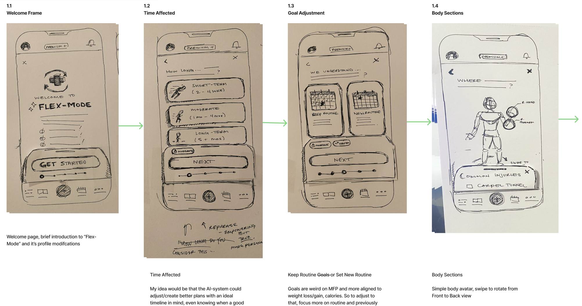
![Hand-drawn wireframes of a mobile app interface showing screens for welcome, time affected, goal adjustment, and body sections, with annotations and brief descriptions.]()
V.01 FlexMode Onboarding Lo-Fi Wireframes, 1.1-1.4
-
![Three sketches of mobile app screens showing fitness or injury tracking interfaces. The first screen displays a questionnaire about common injuries, the second screen shows options for body considerations, and the third screen contains confirmation and activation prompts with a button to activate "Flex Mode."]()
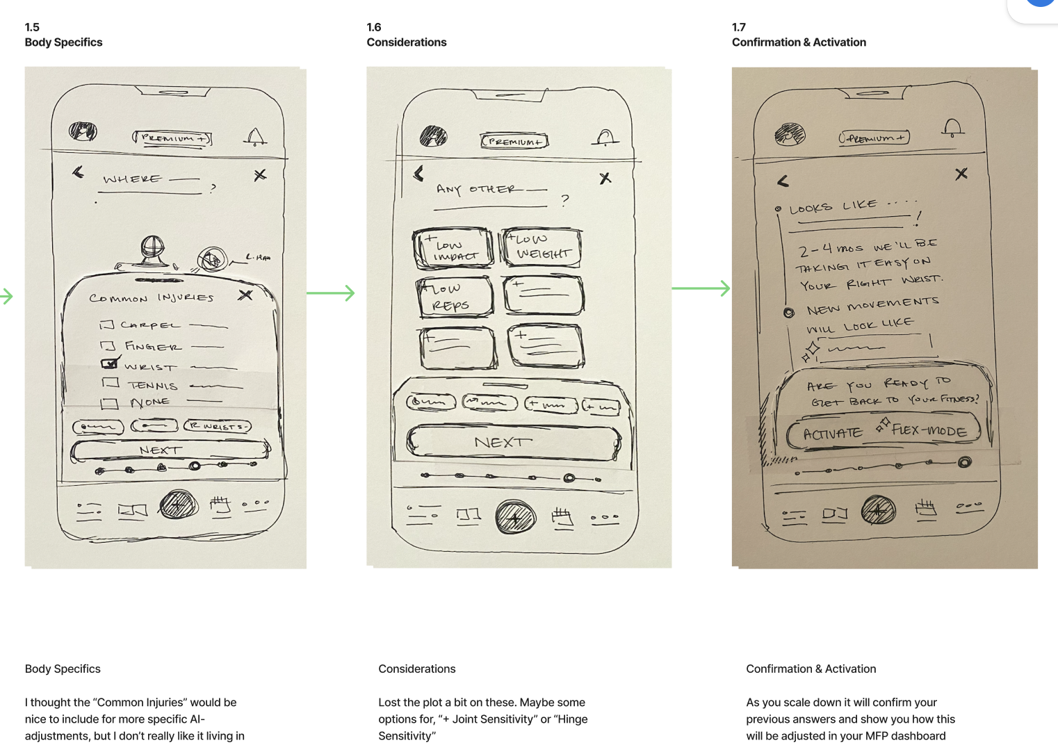
V.01 FlexMode Onboarding Lo-Fi Wireframes, 1.5-1.7
-
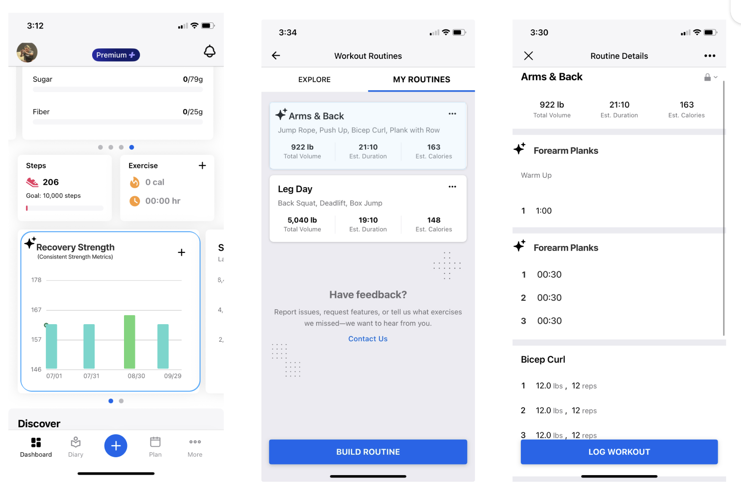
![Screenshots of a fitness tracking mobile app showing workout routines, exercise metrics, and progress charts.]()
Mi-Fi, in-app Concepts
-
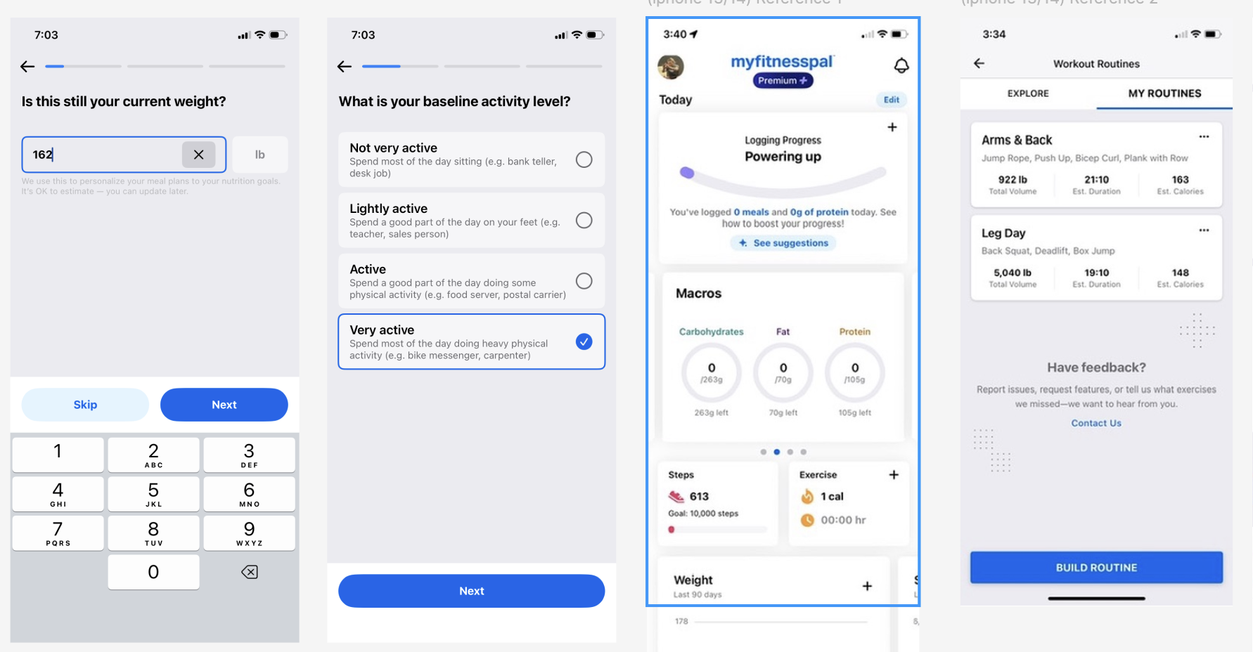
![Screenshots from a fitness app showing questions about current weight, activity level, a user profile with logged meals and macros, and workout routines with exercise details.]()
MyFitnessPal Reference UI & components

v.01 flexmode, onboarding prototype
05
Testing
& final impacts
summary
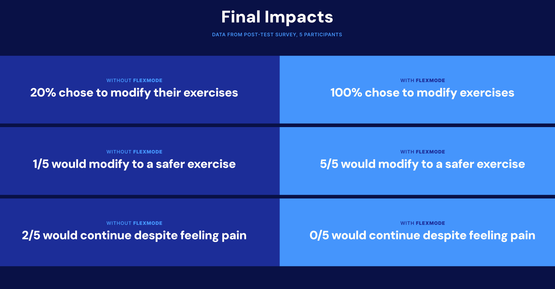
the v.01 hi-fi prototype was tested on a pool of 5 participants.
30-59yrs
experience general limited mobility/injury/post-surgery recovery/chronic pain/arthritis
experience workout-related pain dure to condition(s) 1-4x a week
Users were evaluated on whether flexmode helped them feel more empowered or discouraged (key user need), and whether they shifted them from maladaptive to adaptive behaviors (feature adoption).
Afterwards, a survey measured scalable impact between users’ experiences with and without FlexMode.
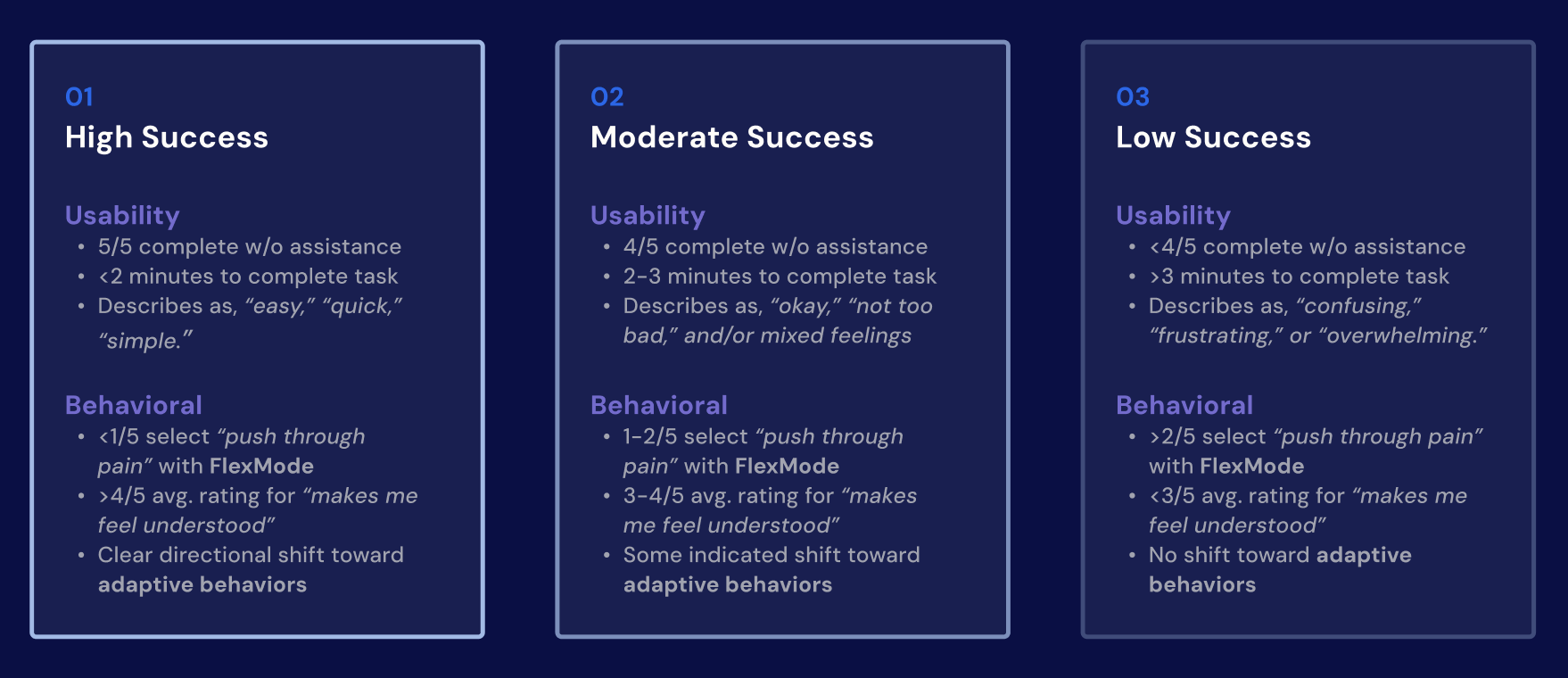
(above) success metrics for usability testing
key useR refinements
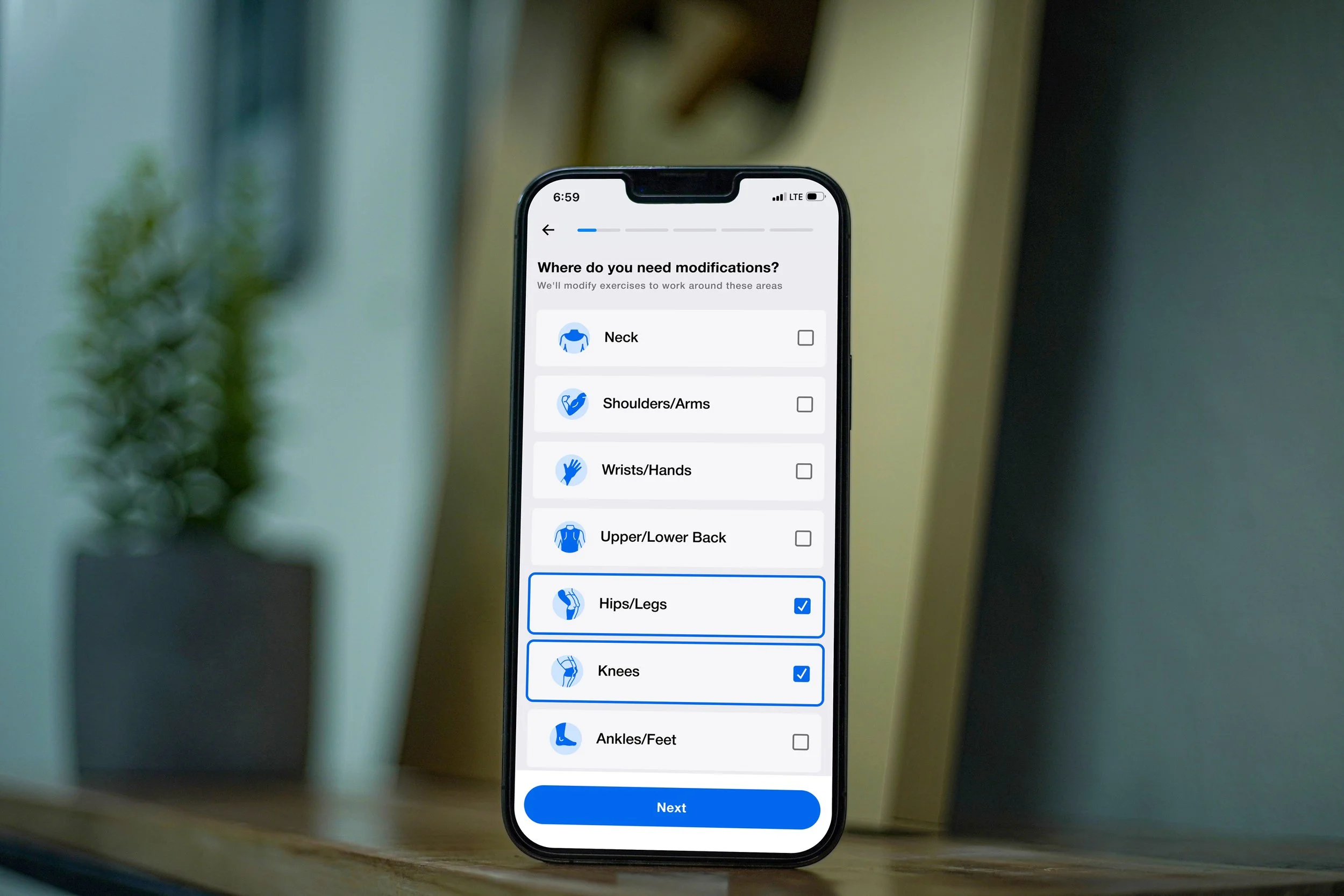
-
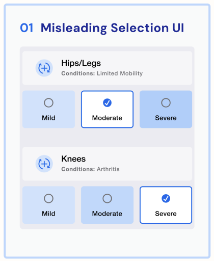
![User interface screen titled 'Misleading Selection UI' with options for Hips/Legs and Knees symptoms, showing selected severity levels: Moderate for Hips/Legs and Severe for Knees.]()
Misleading UI Indicators - Checkmarks confused users who thought it implied multiple selections, changed to radio buttons.
-
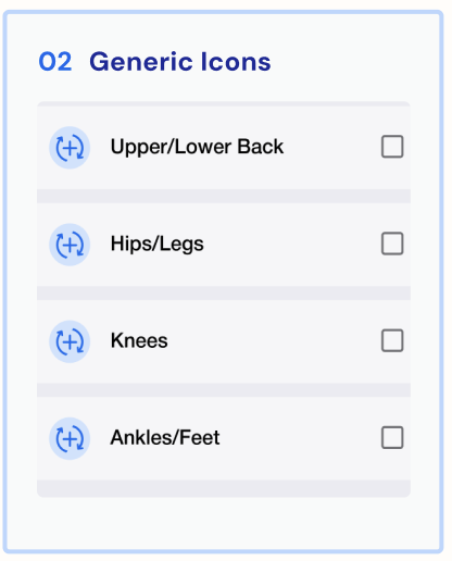
![Section titled '02 Generic Icons' with options for Upper/Lower Back, Hips/Legs, Knees, and Ankles/Feet, each with an icon of a plus sign inside a circle]()
Generic Icons - Each body part had a custom icon to highlight the affected areas.
-
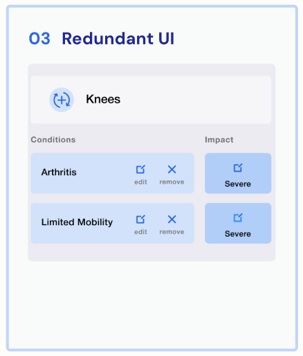
![Screenshot of a user interface titled 'Redundant UI' with a section labeled 'Knees'. It lists two conditions, 'Arthritis' and 'Limited Mobility', each with 'edit' and 'remove' options, and both are marked with 'Severe' impact.]()
Redundant UI - Convoluted composition and actions. Users felt it was confusing. Why take them back to different frames when they could return to one? (What’s affecting These Areas, V.01.4)
-
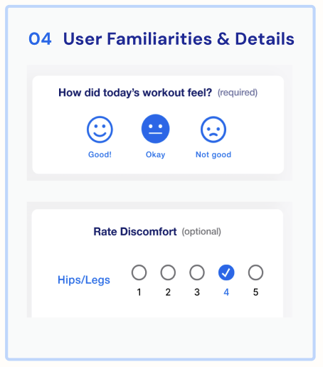
![Section titled 'User Familiarities & Details' asking how today's workout felt, with options 'Good!', 'Okay', and 'Not good,' and a 'Rate Discomfort' scale from 1 to 5, with 4 selected.]()
User Familiarities - Noted US users are more accustomed to seeing Negative → Positive order, “Rate Discomfort” needed defining metrics (“1=No Discomfort, 5 = Very Bad…”

v.02 flexmode, onboarding prototype
reflections
I realized too late that MyFitnessPal was pretty outdated compared to when I had used it in the early 2010s.
I was concerned it was an insufficient platform to test on since it was difficult to reach familiar users. However even with an older, flat platform I was still able to find an impactful solution for modern users and gained a new outlook on identifying critical user gaps.
When one of the users told me, “They just assume you’re healthy and have no problems,” it made me realize a lot of apps probably do this and unintentionally ignore some major user needs in the hustle of plotting a solution. That new perspective gave me a launch pad to examine where else users have fallen through due to major gaps like this.
The boundaries provided great learning tools in how to focus creative solutions within established brand guidelines and how to solve for the most impactful user need without the expansive freedom of starting from scratch.
however, I was too granular around adaptability metrics and what that looks like, that I didn’t think of how this would integrate into their current goals aside from their preexisting workouts/calorie counts.
if i were to redo this process, i’d be more mindful to flex in between high-level flows and pixelated details.