


A heuristic audit & mobile-responsive redesign for the Timberline Lodge Online Store
Project Context
Over 4 months, I was the lead ux researcher and ui designer for this project and worked directly with their head of online retail and head of retail.
during that time, I conducted a UI heuristic audit of Timberline Lodge's online store, redesigning it for current e-commerce usERS.
Timberline Lodge has been one of the most historic pacific northwest landmarks, for over 90 years.
As they expand their online presence, the challenge was to create a cohesive shopping experience that honored the lodge’s venerability, while meeting modern expectations of digital customers.
01
The clients identified several critical pain points affecting customer satisfaction and conversion rates on their existing online store.
Key Assumptions:
Navigational limitations were primarily
a result of their Shopify themeProduct information was intuitive to find
Email sign-up prompts were ineffective
and frustrating to usersSite traffic to the online store was also
a growing concern
These assumptions became the foundation for research and a direct comparison to any user counter-evidence.
overview
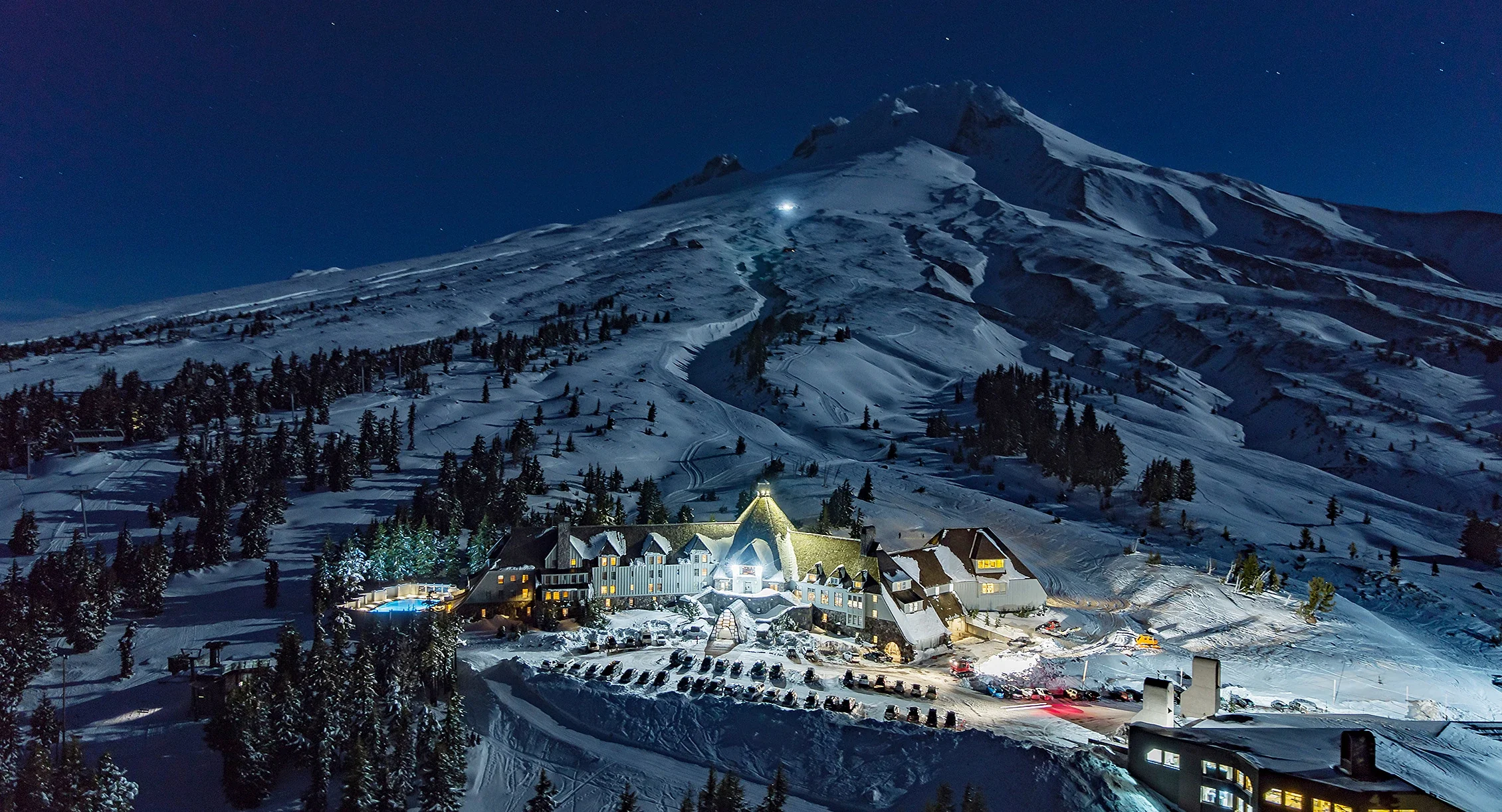
(Above) Timberline Lodge Portland International Airport storefront
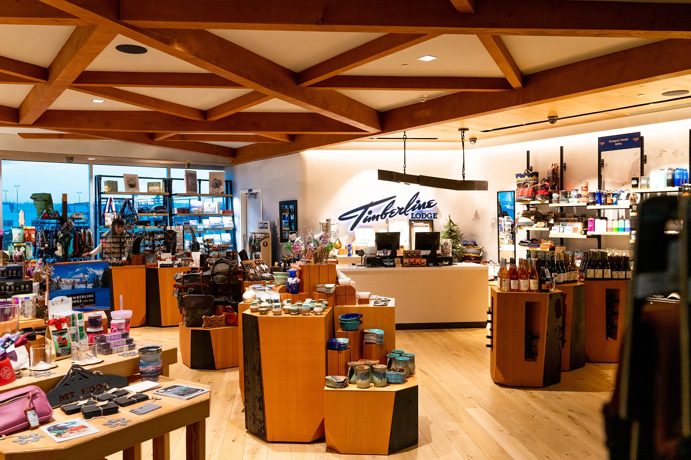
(below)
Former Timberline Online Store
-
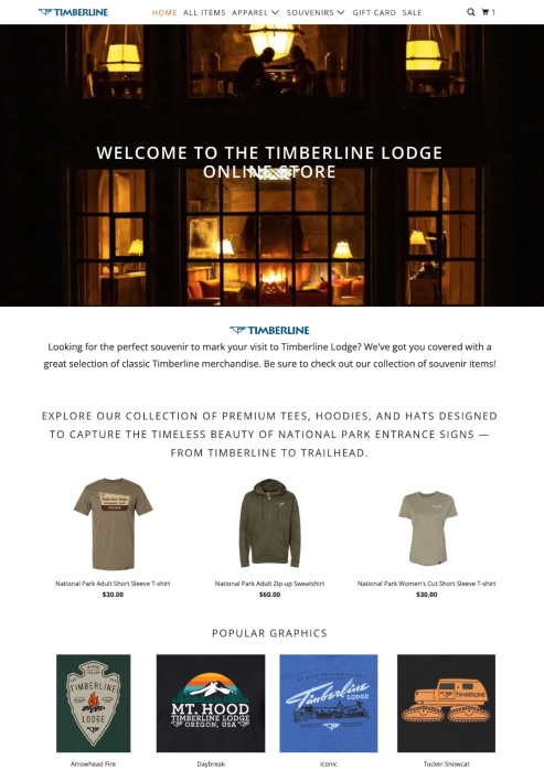
![A cozy lit-up house at night with large windows showing people sitting inside, advertising Timberline Lodge merchandise, including T-shirts, hoodies, hats, and graphic designs related to national parks and mountain themes.]()
Home Page, Former Timberline Lodge Online Store (Start of project, Nov. 2025)
-
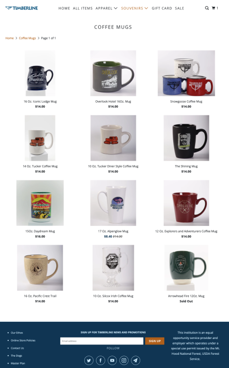
![Collection of nine coffee mugs with various designs and prices, including 16 oz. Iconic Lodge Mug, Overlook Hotel 16 oz. Mug, Snowgoose Coffee Mug, 14 oz. Tucker Coffee Mug, 10 oz. Tucker Dinner Style Mug, The Shining Mug, 15 oz. Daydream Mug, 17 oz. Alpenwolf Mug, 12 oz. Explores and Adventurers Coffee Mug, 16 oz. Pacific Crest Trail Mug, 10 oz. Silcox Irish Coffee Mug, and Arrowhead Fire 12 oz. Mug (sold out).]()
High-Level Browsing page, Former Timberline Lodge Online Store (Start of project, Nov. 2025)
-
![A 16 oz blue ceramic coffee mug with a Timberline logo and design, displayed on a website for purchase, with additional mug options shown below.]()
Product Page, Former Timberline Lodge Online Store (Start of Project, Nov. 2025)
02
Research set out to analyze whether assumptions were directly contributing to dissatisfied customers and understand how the store was acquiring its online customer base.
Methods
Heuristics Audit
Competitive Analysis
user interviews
user survey
participants
users familiar with timberline lodge
recently (<2yrs) shopped on their online store/in-person store
recently (<2yrs) shopped on ski resort or
snow gear websites
SUpporting surVEY RESULTs
Email sign-ups are effective when content is relevant and personalized to cart.
(Survey found mt. hood/outdoor themed and gifts to be leading shopping intentions)There's no direct path provided from the main site to the online store.
Detailed insights
Site is easy to navigate but has no visual system. Users expect organized content to guide exploration.
Details are hard to find. Users expect familiar visual-led browsing patterns.
research & discovery
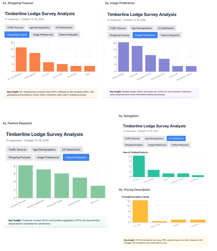
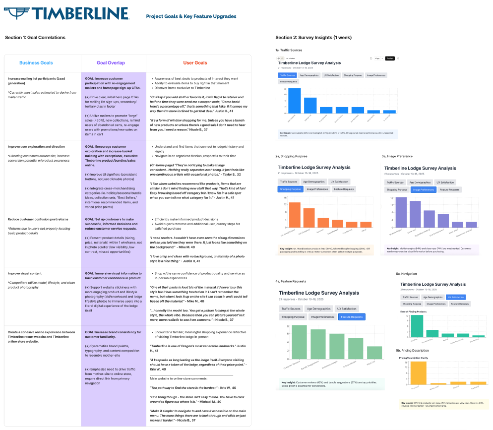
(Above) user survey results, website traffic, photo, and feature preferences
38% traffic from main website
24% from mailing list
84% photos of multiple angles
37% bundled suggestions
74% close-ups
Comparing competitors
I compared several key frames to local competitors and large industry retailers to better evaluate timberline’s strengths, weaknesses, and opportunities and what advantages and potential threats were present locally.
Local Ski Retailers:
Hillcrest Sports
Meadows
Skibowl
Next Adventure (out of business)
Large Online Retails:
The House
Evo
“Everyone visiting should have a token of the lodge, regardless of their price point.
…a keepsake for visitors.”
- kris w.
(Above) competitive analysis, timberline audit
easy wins
systemize ui signifiers
remove social media sharing
standardize visual media
direct ctas on hero
enable email sign-up cta

Key Insights
Platform limitations were not the primary driver of user confusion. Instead, missing signifiers, misplaced information, and uninformative visual content lost and confused users.
The site created dead ends before users arrived on the homepage, and inflated poor UI disruptors.
03
user personas
& prioritization
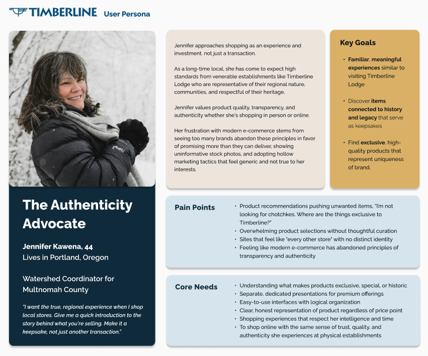
The two primary personas were developed from user interviews, customer survey, and empathy maps. Which served to realign the key problem and redefine the approach forward.
Solution 01
How might we help online shoppers efficiently discover Timberline products through intuitive UI that builds the same trust and keepsake experience they expect from Timberline Lodge?
Solution 2
How might we re-engage online shoppers through targeted email ctas that highlight meaningful sales, respecting their need for relevance over frequency?
features
Must Haves
direct navigation link from main site
to online storeemail sign-up ctas
clear hierarchal homepage sections
standardized visual media & product descriptions
Nice to Haves
systemized ui signifiers
cross-merchandised categories
customer reviews
Could Haves
historical significance descriptors
lifestyle/varied photos
04
Designs
& testing
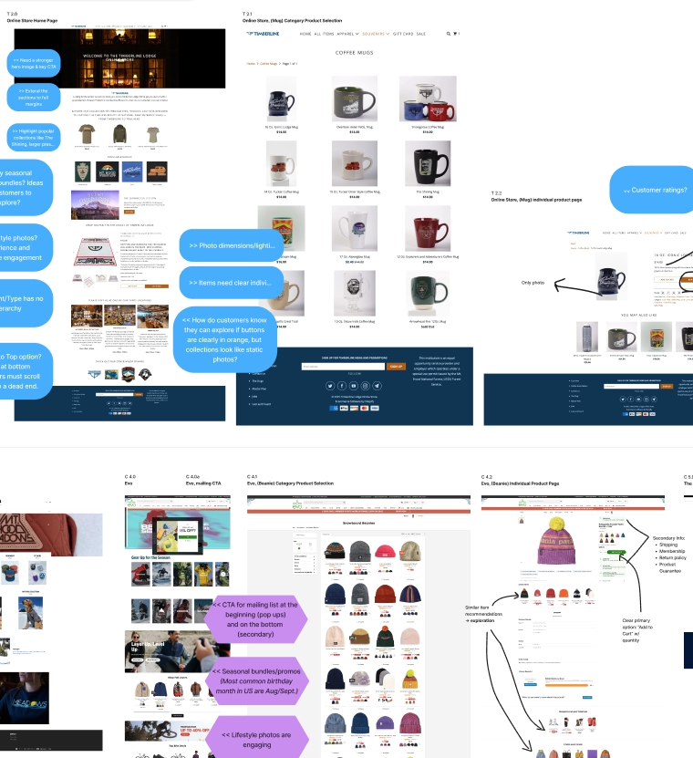
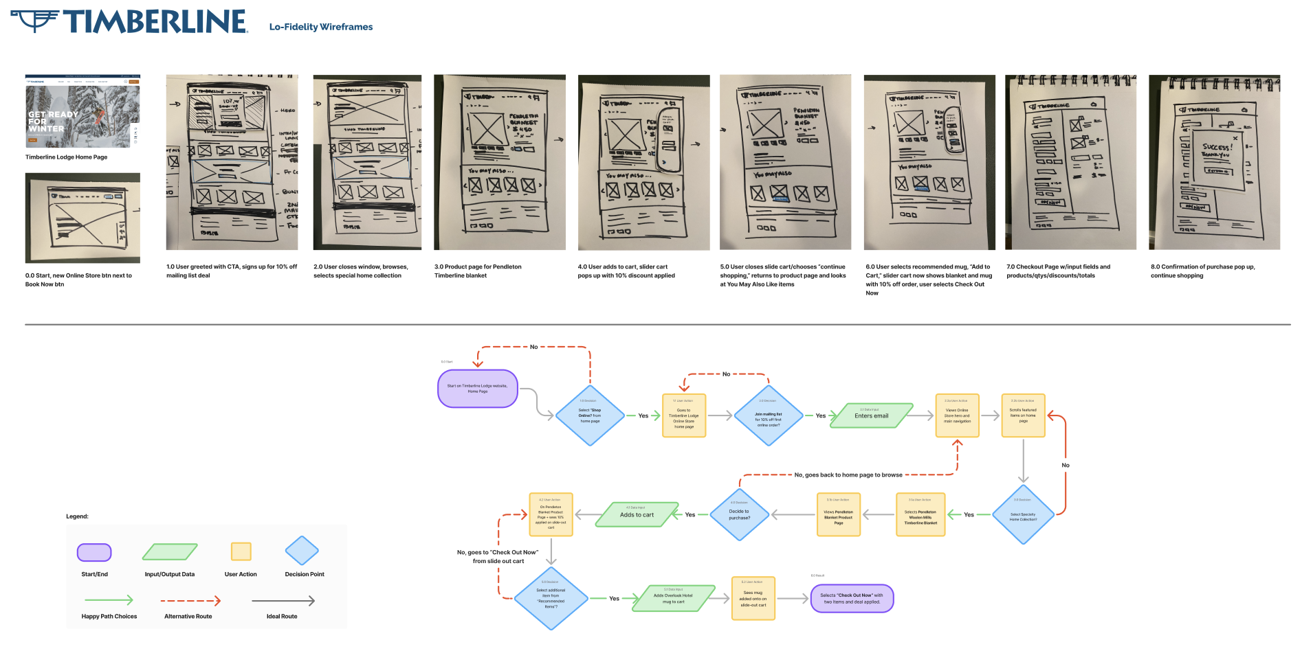
A lo-fidelity browsing and checkout flow was created to strategically test users for navigational ease, product comprehension, CTA engagement, purchase confidence, and site exploration.
Using Timberline's existing Shopify template, Parallax, I was able to show changes within
their current setup, including mobile frames.
Usability Testing
6 participants
30-65 years
4 desktop
2 mobile
familiar with timberline lodge brand
ski/snowboard shopping experience
task-oriented or browsing-oriented
shopping behavior
Success Metrics
UI & Navigation described as “easy/simple.”
> 4/5 score in purchase confidence
used alternative methods to explore the site apart from the top navigation
users engaged positively with email pop-up
refinements
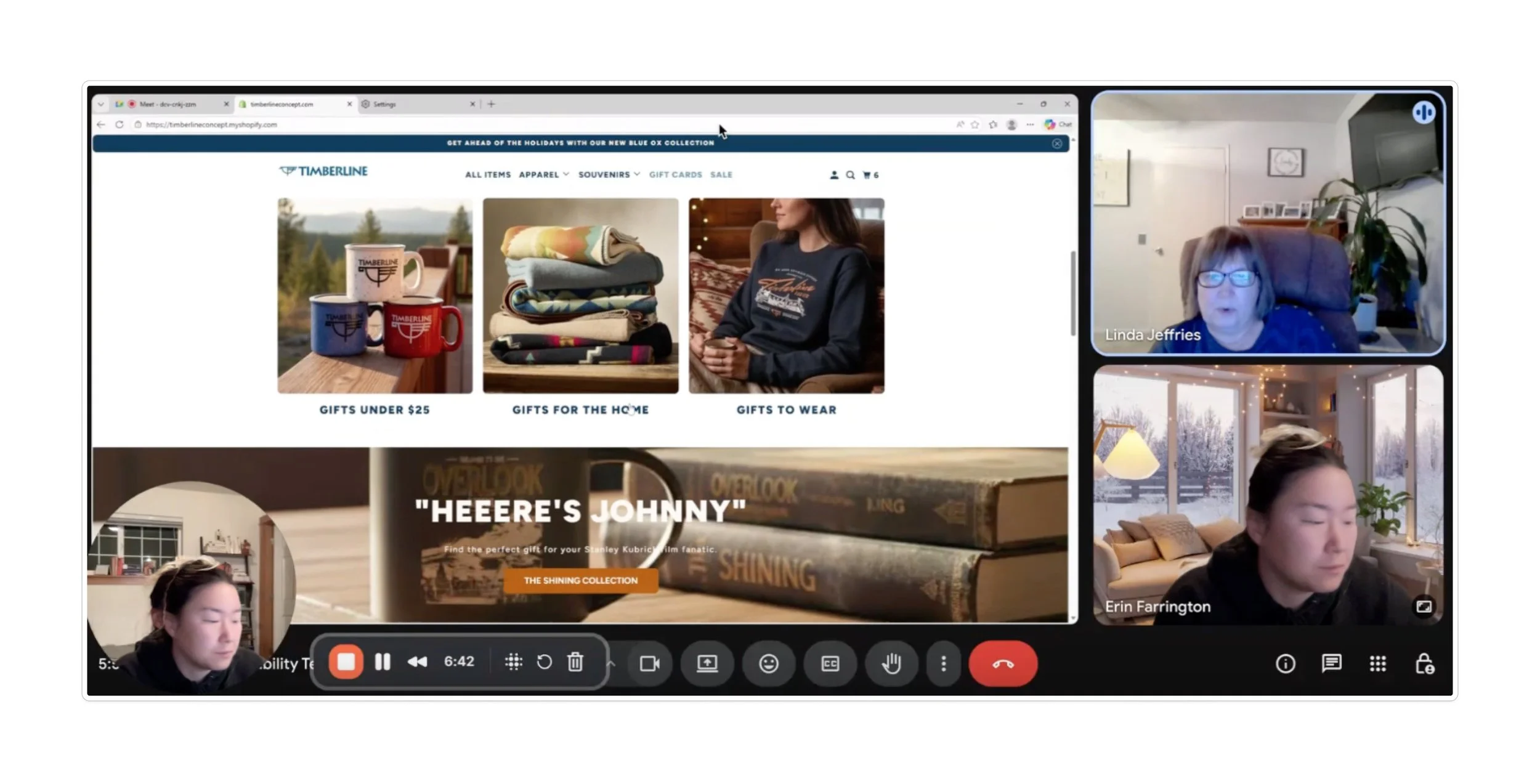
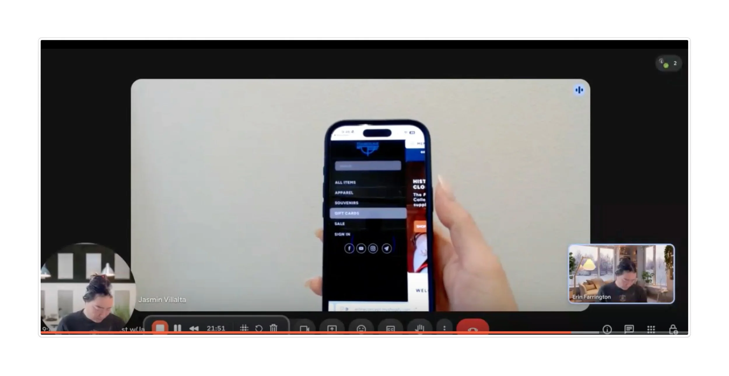
usability test images
(top) Linda referencing the collections and homepage organization, (bottom) Jasmin commenting on mobile menu
Navigation Updates:
‘Local Favorites’ browsing page moved up on homepage for quicker entry into shopping mental model.
mobile menu contrast increased for bolder category visibility.
main website could not get a direct link to online store, operated externally from timberline lodge
Email Sign-Ups:
cta pop-ups initiated on homepage and at cart
given dedicated newsletter sign up page
Purchase Confidence:
All users easily found updated pricing, sizing, and care instructions.
customer reviews enabled, Both user types said would push purchase confidence from 4 to 5 out of 5.
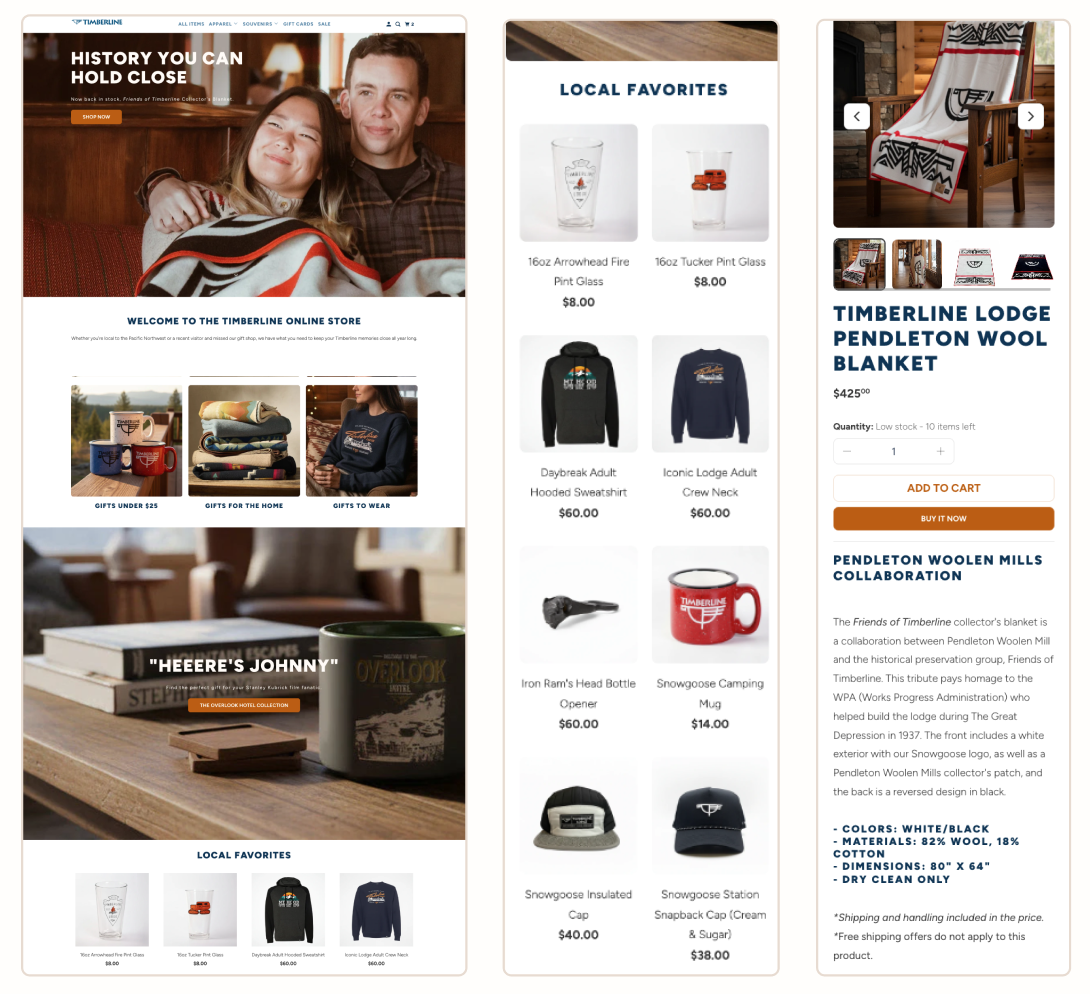
hi-fidelity redesign
05
a comparative a/b survey tested 11 participants on usability test metrics.
final impacts
overall
81.8%
preferred the redesigned shopping experience
navigation
4.09/5 avg
navigational improvement score from the former store to the redesign.
confidence
100%
found product images clearer and more helpful
exploration
81.8%
more likely to explore beyond their initial search
ui signifiers
100%
had better guidance to featured products on the redesign compared to the former website.
takeaways
Working with Timberline Lodge meant designing within real constraints, wrangling with shopify, comparing actual business goals, and verifying real assumptions.
Parallax provided genuine work challenges that helped me empathize with what clients actually face with builders like shopify.
If I were to do this again, I'd focus testing on either mobile or desktop rather than both. The broad approach diluted findings I could have explored with honed objectives.
the director of retail operations for timberline (george sanidas) requested documentation of the research and told me they'd been wanting to make these changes for years and now had data to support them.